Project Overview
Glamora is a modern fashion shopping mobile app concept designed to make online clothing shopping more intuitive, engaging, and convenient. The project focuses on creating a visually appealing shopping experience where users can explore clothing collections, discover trending styles, review product details, select product variations, and complete their purchases with ease.
The interface combines elegant fashion imagery, a neutral color palette, clean typography, and a structured layout to create a premium shopping experience. From the home screen to the product details and shopping cart, every screen is designed to help users navigate the shopping journey with clarity and confidence.
Project Goals
- Create a modern and visually engaging fashion eCommerce mobile interface.
- Simplify product discovery through clear categories and product cards.
- Present product images, pricing, sizes, colors, and descriptions effectively.
- Make product selection and cart management easy to understand.
- Design a streamlined checkout journey with clear pricing information.
- Establish a consistent visual design system across the app.
The Challenge
Fashion eCommerce apps need to balance visual appeal with usability. Shoppers want to explore products, compare styles, select the right size and color, and understand pricing without unnecessary friction.
The key design challenge was to organize essential shopping information into a mobile-friendly interface while keeping the experience clean, attractive, and easy to navigate. Product imagery needed to remain the primary focus without compromising access to important actions such as adding items to the cart or proceeding to checkout.
The Solution
The solution was a mobile-first shopping interface built around a simple and familiar user journey. A category-based home screen helps users discover products, while dedicated product detail screens provide clear information and selection controls.
A structured shopping cart keeps product variations, quantities, item prices, and order totals visible. Consistent spacing, rounded components, intuitive icons, and high-contrast primary actions help create a cohesive experience throughout the shopping process.
Key Features
1. Fashion-Focused Home Screen
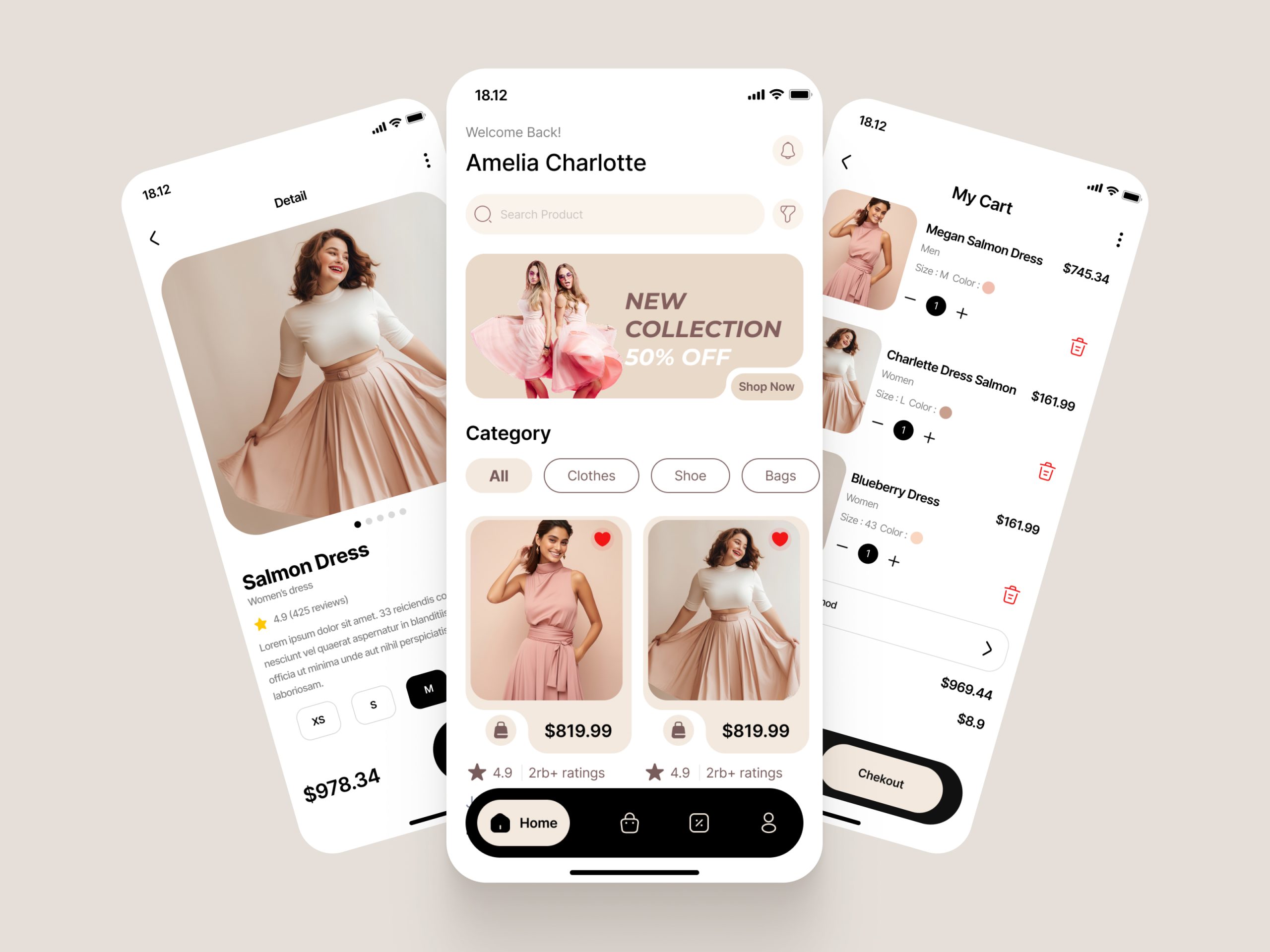
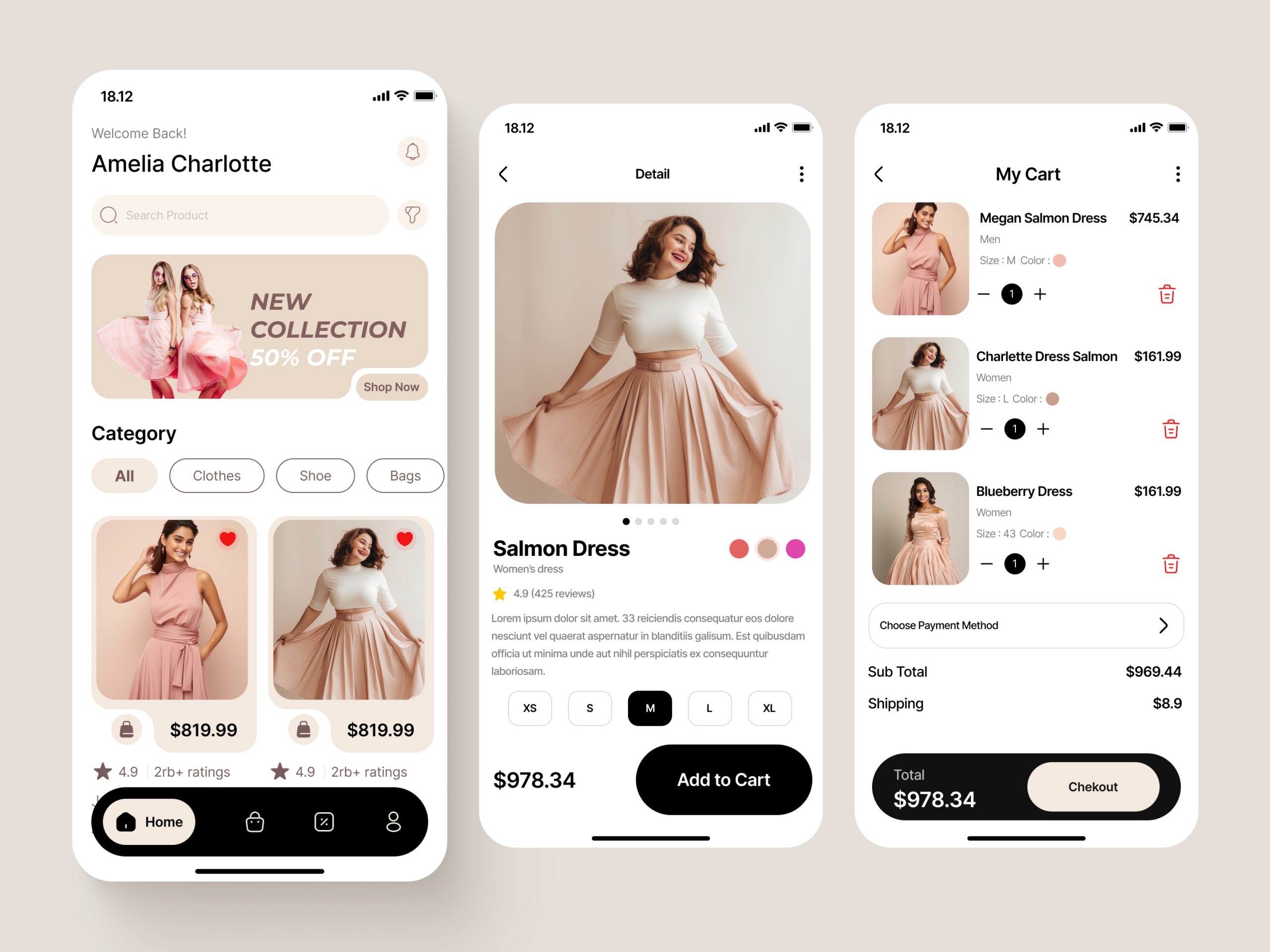
A welcoming home screen introduces users to featured collections, promotional offers, product categories, and curated clothing items. Product cards combine imagery, pricing, ratings, and wishlist actions to support browsing and product discovery.
2. Product Discovery and Categories
Clearly defined category filters help shoppers browse clothing and accessories without navigating through unnecessary screens. The organized product grid makes it easier to scan available items and compare styles.
3. Detailed Product Pages
Large product imagery takes center stage, supported by product names, descriptions, ratings, color options, and size selectors. A prominent Add to Cart button makes the next step clear.
4. Wishlist and Product Favorites
Heart-shaped wishlist controls allow users to mark products they are interested in, creating a convenient way to keep track of favorite styles while browsing.
5. Shopping Cart Management
The cart interface displays product thumbnails, selected variations, quantities, individual prices, and removal controls. This gives shoppers a clear overview of their selected items before moving forward.
6. Clear Order Summary
Subtotal, shipping charges, and the final total are presented in a structured layout. A dedicated checkout action helps users identify the next step in the purchasing process.
7. Consistent Mobile Navigation
A persistent bottom navigation bar provides access to key areas of the shopping experience, helping users move between the main shopping screen and other app sections.
UI/UX Design Approach
The design approach prioritizes visual hierarchy, usability, consistency, and mobile accessibility.
- Visual hierarchy: Product photography, product names, prices, and primary actions receive clear visual emphasis.
- Intuitive navigation: Familiar navigation patterns and recognizable icons help users understand where to go next.
- Reduced cognitive load: Related product information is grouped together to make scanning and decision-making easier.
- Consistent components: Buttons, category filters, product cards, and selection controls follow a unified visual language.
- Action-oriented layouts: Important actions, including Add to Cart and Checkout, remain visually prominent.
- Responsive thinking: The interface is structured around mobile screen constraints, with attention to readable text, touch targets, and spacing.
Visual Design System
Color Palette
The interface uses warm beige, soft blush pink, off-white, and black to create a refined fashion aesthetic. These tones complement the product photography while maintaining contrast between content, controls, and primary actions.
Typography
Clean, modern typography establishes a clear hierarchy between headings, product names, prices, descriptions, and supporting information. Bold text highlights important decisions, while lighter secondary text keeps the interface visually balanced.
UI Components
Rounded product cards, pill-shaped category filters, circular color swatches, size selectors, quantity controls, and high-contrast action buttons create a consistent component system throughout the app.
Imagery and Layout
Large fashion images communicate product style and quality. Generous spacing, rounded image containers, and structured content sections keep the interface organized without distracting from the products.
My Role & Responsibilities
- Mobile app UI/UX design
- User journey and shopping flow planning
- Information architecture and screen organization
- Product discovery and category browsing interface
- Product detail and variation selection design
- Shopping cart and order summary interface
- Visual design system and UI component consistency
- Typography, color palette, spacing, and visual hierarchy
- Usability-focused layout refinement
Tools & Technologies Used
- Figma: Interface design, screen layouts, reusable components, and design system development
- UI/UX Design: Mobile-first interface design, information architecture, and interaction planning
- Design Systems: Component consistency, typography, color, and spacing standards
Project Outcome
The Glamora concept brings the essential stages of fashion shopping into a cohesive mobile experience. The design connects product discovery, product evaluation, size and color selection, cart management, and checkout preparation through a consistent interface.
The result is a polished fashion eCommerce app concept that balances an editorial visual style with practical shopping functionality. It demonstrates how thoughtful mobile UI/UX design can make product browsing easier to understand and help shoppers move through the purchase journey with greater clarity.
Final Thoughts
A successful fashion shopping app needs more than attractive product images. It needs a clear structure that helps shoppers discover products, make informed selections, and understand their orders before checkout.
Glamora explores this balance through a clean visual design system, intuitive navigation, and a user-centered shopping flow—creating a strong foundation for a modern fashion eCommerce experience.