Project Overview
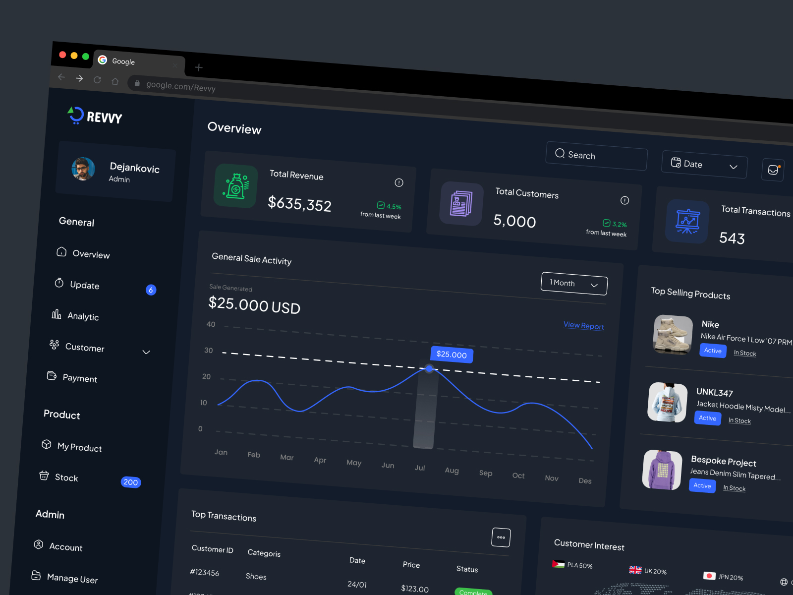
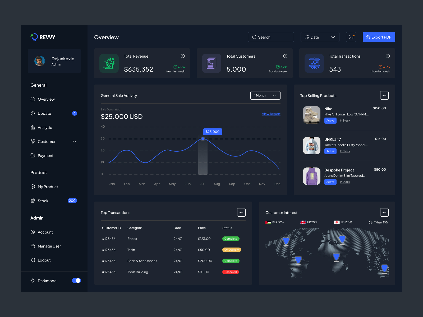
Revvy is a modern sales analytics dashboard concept designed to help businesses understand sales performance through clear, actionable data. With an intuitive interface, structured data visualization, and a well-organized layout, the dashboard makes it easier for users to monitor key metrics, identify trends, and make informed business decisions.
The goal was to create a professional, user-friendly analytics experience that turns complex sales data into meaningful insights while keeping essential information accessible at a glance.
The Challenge
Sales data can quickly become difficult to interpret when important metrics are scattered across multiple reports and views. Businesses need a centralized dashboard that presents critical information clearly without overwhelming users.
The challenge was to organize sales insights into a logical visual hierarchy, simplify data interpretation, and create an interface that supports efficient analysis and decision-making.
Our Solution
We designed a clean, data-driven dashboard focused on usability, clarity, and scalability. The interface prioritizes important metrics, uses visual elements to make performance trends easier to understand, and maintains a consistent design language throughout the experience.
Strategic content placement and clear navigation help users focus on the information that matters most, creating a more streamlined way to explore sales performance.
Key Features
- Performance at a Glance: A structured overview of key sales metrics for quick analysis.
- Data Visualization: Charts and visual indicators that help users understand trends and performance patterns.
- Intuitive Interface: A clean layout that makes complex information easier to navigate.
- Clear Information Hierarchy: Important data is prioritized to support faster, more confident decisions.
- Conversion-Focused Design: Thoughtful placement of calls to action supports clear user journeys.
- Scalable Design System: Consistent UI components help maintain visual coherence as the product evolves.
Design Approach
Our approach combined modern SaaS aesthetics with practical UX principles. We focused on reducing visual clutter, establishing a clear hierarchy, and presenting data in a way that feels accessible rather than overwhelming.
Every interface element was designed to serve a purpose—from metric cards and charts to navigation and action areas—resulting in a cohesive dashboard experience.
The Outcome
The resulting design provides a strong foundation for a sales analytics platform that makes business data easier to scan, understand, and act on. By combining clear visualizations with a consistent interface, Revvy demonstrates how thoughtful product design can simplify complex workflows and support data-informed decision-making.
Technologies & Services
Project Type: Web Application / SaaS Dashboard
Services: UI/UX Design, Dashboard Design, Data Visualization, Interface Design, Design System
Let’s Build Your Next Digital Product
Have an idea for a SaaS platform, analytics dashboard, or web application? Reedify System can help transform your vision into a clear, intuitive, and scalable digital experience.