Project Overview
TalkHub is a modern customer communication and task management dashboard concept designed to help teams manage customer conversations, organize support requests, and keep important contact information accessible in one workspace.
The interface brings together a shared inbox, conversation management, ticket tracking, priority indicators, and customer details in a structured desktop experience. Its clean layout and teal-accented visual identity create a professional workspace that balances information density with usability.
The primary design focus was to make customer support workflows easier to navigate by keeping conversations, task statuses, and relevant customer information visible within a unified interface.
Project Goals
- Create a centralized interface for managing customer conversations and support requests.
- Improve the visibility of conversation status, priority, and assignment.
- Keep customer contact information and recent tickets accessible alongside conversations.
- Simplify message composition and internal team communication.
- Establish a consistent visual design system for a professional SaaS dashboard.
- Organize complex information into clear, scannable sections.
The Challenge
Customer support teams often need to review incoming messages, understand customer history, prioritize requests, and respond while keeping track of outstanding tasks.
When these activities are spread across disconnected screens, important context can become harder to find. The design challenge was to bring these related activities together without overwhelming users with excessive information or competing interface elements.
TalkHub explores how a well-organized dashboard can connect the conversation queue, active message thread, and customer information in a single working environment.
The Solution
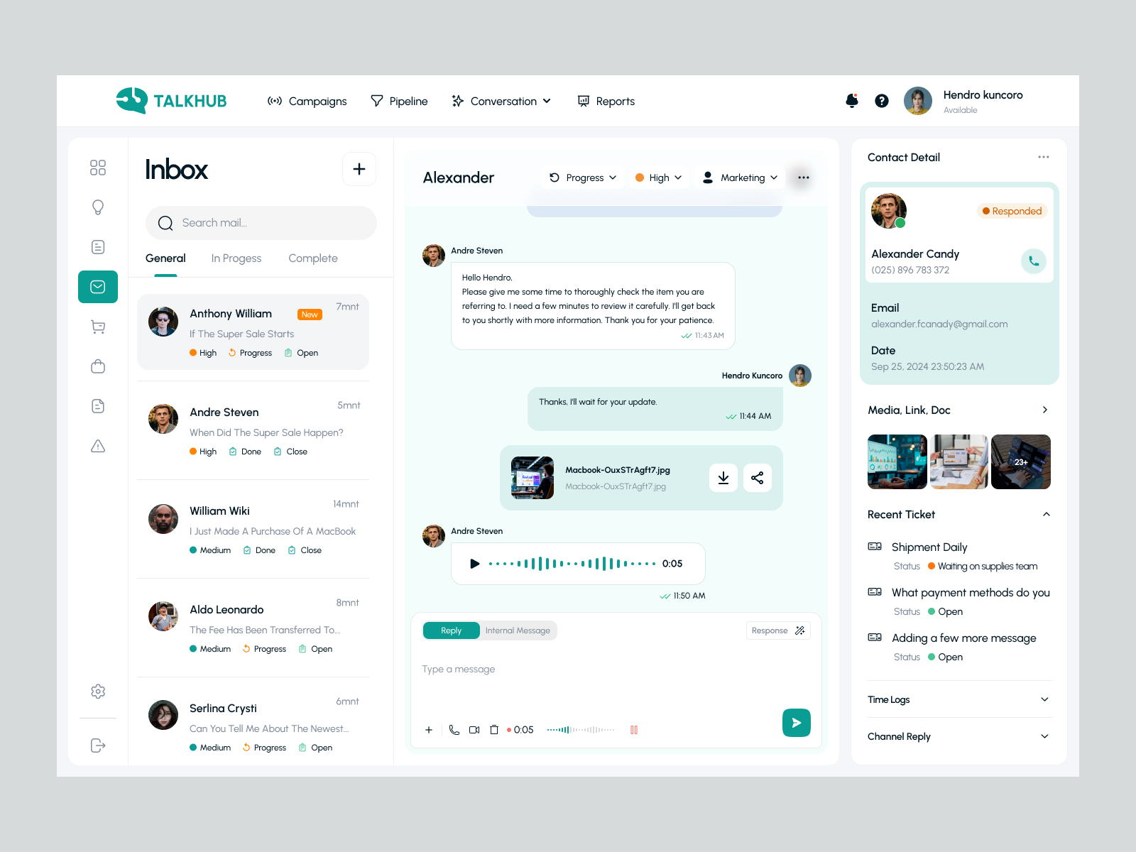
The solution is a three-panel customer support workspace supported by a clear navigation system.
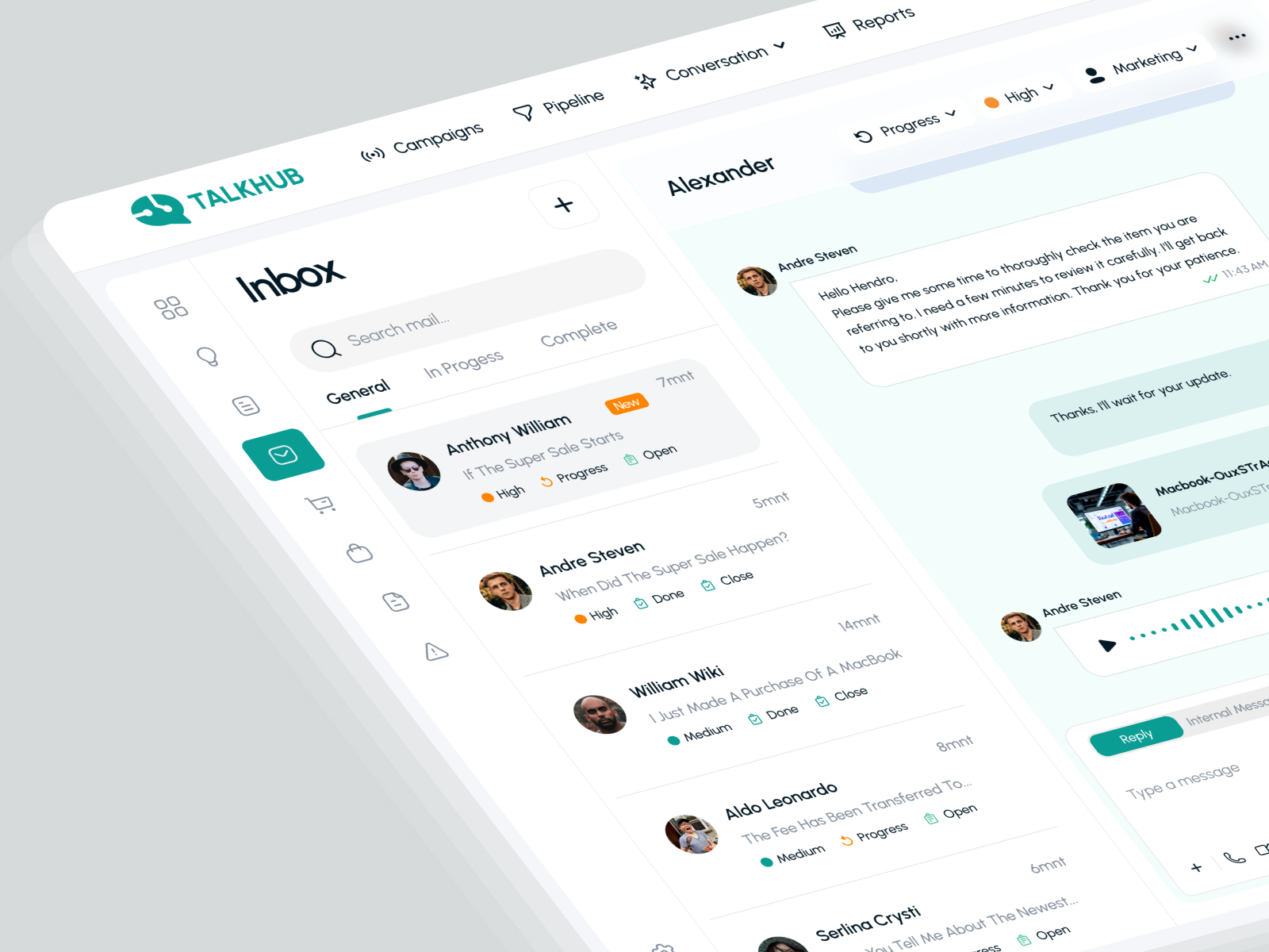
The left panel organizes conversations by status and displays customer names, message previews, timestamps, and priority indicators. The central panel provides space for the active conversation, message attachments, audio messages, and reply controls. The right panel presents contact details, recent tickets, shared media, and additional support information.
This structure keeps the primary workflow visible while allowing users to access relevant context without leaving the active conversation.
Key Features
1. Centralized Conversation Inbox
The inbox provides a structured overview of customer conversations, including message previews, timestamps, status labels, and priority indicators. Search and status-based tabs help users locate and organize relevant conversations.
2. Conversation Management
The main conversation panel presents message history in a familiar chat interface. Incoming and outgoing messages use distinct visual treatments, while timestamps and message status indicators help communicate the sequence of interactions.
3. Priority and Status Tracking
Visible priority levels, progress states, and team assignment controls help communicate how conversations are categorized and managed. These elements give users a clearer view of each conversation’s current state.
4. Customer Contact Details
A dedicated contact panel displays customer information, email, phone number, response status, and recent activity. Keeping this context alongside the conversation supports more informed customer interactions.
5. Ticket and Task Management
The recent-ticket section brings related support requests into the same workspace. Ticket titles and status indicators help users review outstanding items without losing sight of the current conversation.
6. Rich Message Composer
The message composer includes reply and internal-message modes, along with controls for attachments and other communication options. The interface separates the message-writing area from the conversation history to maintain a clear visual structure.
7. Media and Attachment Handling
A dedicated media section provides a visual overview of shared files and documents. Attachment previews within the conversation also make supporting information easier to recognize.
8. Navigation and Reporting
The top navigation provides access to campaigns, pipeline, conversations, and reports, while the vertical sidebar offers access to additional workspace sections. This structure creates a consistent starting point for different support-related tasks.
UI/UX Design Approach
The design prioritizes information architecture, visual hierarchy, and efficient navigation.
- Three-panel layout: Separates conversation browsing, active communication, and customer context into distinct areas.
- Clear information hierarchy: Uses typography, spacing, and alignment to distinguish primary content from supporting information.
- Status visibility: Uses concise labels and color-coded indicators to make priority and progress easier to scan.
- Contextual information: Keeps customer details and recent tickets close to the active conversation.
- Consistent interaction patterns: Applies recognizable controls for search, navigation, messaging, and conversation management.
- Reduced visual clutter: Uses whitespace, subtle borders, and light backgrounds to organize dense interface content.
- Workflow-oriented design: Gives the active conversation the largest workspace while keeping secondary information readily accessible.
Visual Design System
Color Palette
The interface uses teal as its primary accent color, supported by white surfaces, light gray backgrounds, dark text, and subtle status colors. Teal highlights selected navigation items and important actions, while restrained orange and green indicators distinguish priority and progress states.
Typography
A clean sans-serif typeface establishes a readable hierarchy across navigation labels, conversation names, message content, timestamps, and customer details. Bold headings provide structure, while muted supporting text keeps secondary information visually quiet.
Layout and Spacing
The dashboard uses a structured grid with clearly separated panels and consistent spacing. Rounded containers, subtle dividers, and carefully grouped information help organize multiple support functions without making the workspace feel overly complicated.
UI Components
The design system includes navigation icons, conversation list items, status badges, priority indicators, message bubbles, customer information cards, attachment previews, dropdown controls, and message composer elements.
Together, these components create a consistent interface that can serve as a foundation for additional customer support and task management screens.
My Role & Responsibilities
- UI/UX design for a customer support SaaS dashboard
- Information architecture and workspace layout planning
- Conversation inbox and message thread interface design
- Customer contact and ticket detail panel design
- Priority, status, and assignment control design
- Message composer and attachment interface design
- Typography, color palette, and visual hierarchy
- Reusable UI component and design system development
- Usability-focused interface refinement
Tools & Technologies Used
- Figma: Interface design, screen layouts, and component organization
- UI/UX Design: Information architecture, workflow planning, and interface design
- Design Systems: Typography, color palette, spacing, and reusable UI components
Project Outcome
The TalkHub dashboard concept brings customer communication, ticket visibility, and contact context together in one organized interface. Its three-panel layout gives each activity a defined space while maintaining a clear relationship between conversations and related support information.
The resulting design demonstrates a practical approach to SaaS dashboard UX, combining a professional visual identity with a workflow-focused interface for customer support and task management.
Final Thoughts
A customer support dashboard should do more than display information. It should help users understand what needs attention, find the right context, and take the next action without unnecessary navigation.
TalkHub explores this principle through a centralized inbox, visible status indicators, contextual customer information, and a structured conversation workspace. The result is a clean dashboard concept built around clarity, consistency, and everyday support workflows.