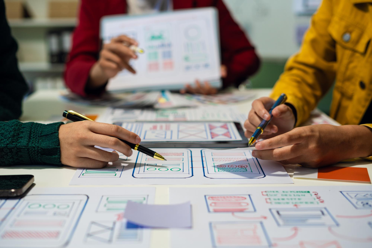
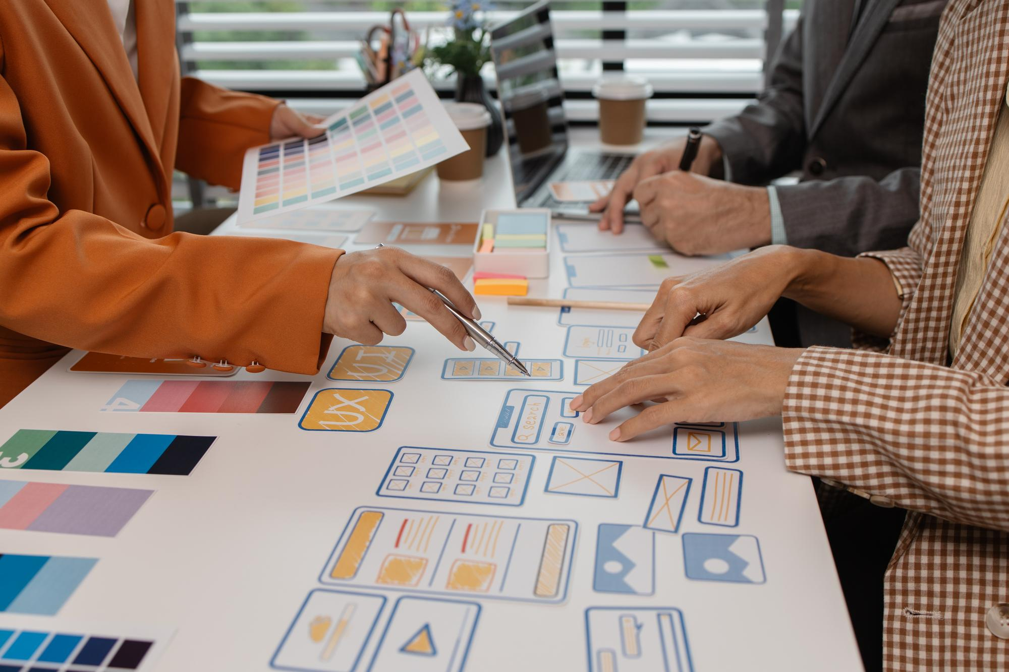
A successful digital product is more than an attractive interface. It should solve real problems, provide a seamless user experience, and help people accomplish their goals with minimal effort. Whether you are building a SaaS platform, a mobile application, a business website, or an enterprise dashboard, a structured UI/UX design process helps turn ideas into usable, effective digital products.
UI/UX design combines research, strategy, information architecture, interaction design, visual design, prototyping, and usability testing. Each stage plays an important role in understanding users, reducing design risks, and creating products that support business objectives.
In this guide, we will explore the complete UI/UX design process, explain what happens at each stage, and share practical tips to help you build better digital experiences.
What Is the UI/UX Design Process?
The UI/UX design process is a structured approach to researching, planning, designing, testing, and improving a digital product’s user experience and interface.
UX (User Experience) design focuses on how a product works and how people interact with it. It considers usability, accessibility, user needs, navigation, and the overall experience.
UI (User Interface) design focuses on how a product looks and how users interact with its visual elements. This includes typography, colors, buttons, forms, icons, spacing, and layouts.
Although UI and UX have different responsibilities, they work together. UX establishes the structure and interaction logic, while UI makes that experience visually clear, consistent, and engaging.
A typical UI/UX design process includes these stages:
- Discovery and project planning
- User research
- Problem definition and strategy
- Information architecture
- User flows and journey mapping
- Wireframing
- UI design and design systems
- Interactive prototyping
- Usability testing
- Developer handoff and implementation support
- Post-launch evaluation and iteration
The process is not always strictly linear. Research and testing may reveal new problems, requiring designers to revisit earlier decisions and refine the solution.
1. Discovery and Project Planning
Every successful design project begins with a clear understanding of the business, the product, and the people who will use it.
Before creating wireframes or visual concepts, designers need to understand why the product is being built, what it should achieve, and which constraints may affect the project.
Key activities
- Conduct stakeholder interviews.
- Understand business goals and product objectives.
- Identify the target audience and major user groups.
- Review existing products, websites, or applications.
- Analyze competitors and market expectations.
- Define project scope, deliverables, and success metrics.
- Identify technical, budget, and timeline constraints.
For example, a company building a SaaS analytics dashboard might want to improve customer retention. During discovery, the design team may learn that users struggle to find important reports, understand performance metrics, and configure their dashboards.
That insight helps establish a more meaningful design objective than simply making the dashboard look modern.
Questions to answer
- What problem are we trying to solve?
- Who experiences this problem?
- What business outcome should the product support?
- What does success look like?
- What constraints must the design accommodate?
Deliverables: Project brief, stakeholder requirements, competitor analysis, initial product goals, and success metrics.
2. Conduct User Research
User research helps designers understand the needs, behaviors, expectations, and frustrations of the people who will use a product.
Without research, teams risk designing around assumptions rather than actual user problems. Research does not always require a large budget or a lengthy study. The right method depends on the project, available resources, and the decisions the team needs to make.
Common user research methods
User interviews: Direct conversations that uncover user goals, motivations, frustrations, and expectations.
Surveys: Useful for gathering feedback and identifying patterns across a larger group of people.
Competitive analysis: Reviewing similar products to understand common patterns, strengths, weaknesses, and opportunities for differentiation.
Analytics review: Examining existing usage data to identify drop-off points, frequently used features, and areas of friction.
Usability testing: Observing people as they attempt to complete tasks in an existing product or prototype.
Contextual inquiry: Learning how users work in their actual environment and what challenges they face.
Create evidence-based user personas
Research findings can be summarized into user personas or practical user profiles. These should represent meaningful patterns in user behavior rather than fictional details added for decoration.
A persona for a SaaS reporting tool might describe a marketing manager who needs to monitor campaign performance, compare results, and share reports without spending hours navigating complex analytics.
This profile helps the design team prioritize features and make decisions based on the user’s goals.
Deliverables: Research findings, user needs, behavioral patterns, pain points, and evidence-based personas where useful.
3. Define the Problem and Product Strategy
Once the team understands the users, the next step is to translate research into a clear problem statement and a focused design strategy.
This stage prevents teams from jumping directly into solutions before understanding the underlying problem.
A useful problem statement identifies the target user, the challenge they face, and why the challenge matters.
For example:
“Small business owners need a simpler way to understand their monthly cash flow because their current reporting tools make it difficult to identify spending patterns and make timely decisions.”
This statement creates a clear direction for design exploration.
Prioritize features and requirements
Not every requested feature needs to be included in the first version of a product. Designers and product teams should prioritize features according to user value, business impact, effort, and technical feasibility.
A simple prioritization framework can help:
- Must-have: Essential to the core user task or product functionality.
- Should-have: Important improvements that support the experience.
- Could-have: Useful enhancements that can be introduced later.
- Won’t-have for now: Features outside the current scope.
For startups, this step is particularly important when defining a minimum viable product (MVP). The goal is to deliver the smallest useful solution that allows the team to validate its assumptions and learn from real users.
Deliverables: Problem statement, design objectives, prioritized requirements, and initial product strategy.
4. Build the Information Architecture
Information architecture (IA) defines how content, features, and functionality are organized within a digital product.
Good information architecture helps users understand where they are, what is available, and how to find what they need.
Poor information architecture often leads to confusing navigation, duplicated sections, hidden features, and unnecessary complexity.
How to create effective information architecture
- List the main content areas and product features.
- Group related items into logical categories.
- Establish a clear hierarchy between primary and secondary sections.
- Create navigation labels that users can understand.
- Validate the structure against common user tasks.
- Simplify or reorganize sections that create confusion.
For a SaaS dashboard, the primary navigation might include Overview, Analytics, Reports, Customers, Integrations, and Settings. The final structure should depend on user needs and the product’s actual functionality.
Card sorting can help teams understand how users naturally group information. Tree testing can help evaluate whether users can find information in a proposed navigation structure.
Deliverables: Sitemap, navigation structure, content hierarchy, and information architecture documentation.
5. Map User Flows and Customer Journeys
A user flow illustrates the steps a person takes to complete a particular task within a product.
A customer journey provides a broader view of the user’s experience across different stages and touchpoints. Both help designers identify unnecessary steps, confusing decisions, and opportunities to improve the experience.
Example: SaaS account creation flow
A simplified registration flow might look like this:
- User visits the website.
- User selects “Start Free Trial.”
- User enters an email address and password or chooses a supported sign-in method.
- User verifies the account if required.
- User completes essential onboarding steps.
- User reaches the dashboard and completes a meaningful first task.
At every stage, designers should ask whether the next action is obvious and whether the information requested is necessary.
For example, asking users to complete a long profile form before they have experienced the product may create avoidable friction.
Tips for better user flows
- Focus on a specific user goal.
- Remove unnecessary steps and repeated questions.
- Make the primary action easy to identify.
- Provide clear feedback after important actions.
- Design useful error, empty, loading, and success states.
- Consider alternative paths and failure scenarios.
Deliverables: User flow diagrams, journey maps where appropriate, task sequences, and interaction requirements.
6. Create Wireframes
Wireframes are simplified representations of a digital interface. They focus on structure, content hierarchy, layout, and functionality before the team invests in detailed visual design.
Wireframes help designers and stakeholders evaluate the proposed experience without being distracted by colors, decorative elements, or polished imagery.
Low-fidelity vs. high-fidelity wireframes
Low-fidelity wireframes use basic shapes, placeholders, and minimal detail. They are useful for exploring layouts quickly and comparing different approaches.
High-fidelity wireframes contain more precise spacing, content, and structural detail. They help teams refine complex screens and prepare for visual design.
What to consider when wireframing
- Content hierarchy and readability
- Primary and secondary actions
- Navigation and page structure
- Information density
- Form layouts and input requirements
- Responsive behavior
- Empty, loading, error, and success states
For a reporting dashboard, wireframes can help determine where key performance indicators, charts, filters, tables, and date controls should appear.
The main objective is to make the interface understandable and efficient before focusing on its appearance.
Deliverables: Low- or high-fidelity wireframes, screen layouts, and initial interaction specifications.
7. Design the User Interface
Once the structure and core interactions are clear, designers can develop the visual interface.
UI design establishes the visual language of the product and ensures that its components work together consistently.
A well-designed interface should look professional, but aesthetics alone are not enough. The design must also support readability, accessibility, usability, and the user’s primary tasks.
Key elements of UI design
Typography: Select readable typefaces, establish a clear type scale, and maintain consistent text hierarchy.
Color system: Use colors purposefully to communicate hierarchy, brand identity, status, and interaction.
Spacing and layout: Apply consistent spacing rules to improve readability and create visual rhythm.
Buttons and controls: Make interactive elements recognizable and distinguish primary actions from secondary ones.
Icons and imagery: Use meaningful visual assets that support understanding rather than introduce unnecessary decoration.
Visual hierarchy: Guide attention toward important information and the next logical action.
Responsive design: Adapt layouts and interactions to different screen sizes and device capabilities.
Build a consistent design system
A design system is a collection of reusable components, design tokens, patterns, and guidelines that help teams maintain consistency across a product.
It may include:
- Color and typography tokens
- Spacing and layout rules
- Buttons and form elements
- Navigation components
- Cards, tables, and modal dialogs
- Status indicators and alerts
- Accessibility guidelines
- Component states and usage documentation
For example, a consistent button system helps users recognize interactive elements across different screens. It also helps developers implement changes more efficiently.
Tools such as Figma make it easier to create reusable components, manage variants, and maintain shared design libraries.
Deliverables: High-fidelity UI screens, component library, design tokens, and design system documentation as appropriate to the project.
8. Build an Interactive Prototype
A prototype simulates how a product or interface behaves. It allows stakeholders, designers, and users to experience the proposed solution before full development begins.
Depending on the project’s needs, a prototype can range from a simple clickable wireframe to a detailed simulation of a nearly finished interface.
Why prototyping matters
- Demonstrates how screens connect.
- Tests navigation and interaction patterns.
- Helps stakeholders understand the proposed experience.
- Reveals usability problems before development.
- Supports feedback and design validation.
- Reduces the risk of building the wrong solution.
For example, a prototype of a mobile banking app might simulate the process of reviewing transactions, transferring funds, and confirming a payment.
The team can test whether users understand the flow before investing in the complete implementation.
Deliverables: Clickable prototype, interaction examples, and a testable representation of important user journeys.
9. Conduct Usability Testing
Usability testing evaluates how easily people can use a product to complete meaningful tasks.
Instead of asking only whether users like the design, usability testing examines what happens when they interact with it.
Can they find the right feature? Do they understand the labels? Can they complete a task without assistance? Where do they hesitate or make mistakes?
How to conduct usability testing
Step 1: Define the objective. Identify the specific usability questions you want to answer.
Step 2: Select representative participants. Recruit people who match the product’s intended audience as closely as practical.
Step 3: Prepare realistic tasks. Ask participants to complete meaningful activities, such as finding a report or updating an account setting.
Step 4: Observe behavior. Watch where participants succeed, hesitate, become confused, or take an unexpected route.
Step 5: Identify recurring issues. Separate isolated comments from problems that affect task completion or understanding.
Step 6: Improve and retest. Prioritize the most important issues, update the design, and validate the changes.
Metrics worth tracking
- Task completion rate
- Time on task
- Error rate
- Navigation success
- User-reported ease of use
- Abandonment at critical steps
Use metrics that align with the product’s goals. For example, an e-commerce checkout flow may prioritize completion and abandonment, while a complex enterprise dashboard may focus on task success, navigation efficiency, and error frequency.
Testing does not need to wait until the interface is visually complete. Early wireframes can reveal major usability issues before they become expensive to fix.
Deliverables: Usability findings, prioritized issues, design recommendations, and an updated prototype or interface.
10. Prepare the Developer Handoff
A successful UI/UX design process continues beyond the final design file. Designers need to communicate the intended behavior and visual specifications clearly so developers can implement the experience accurately.
An incomplete handoff can lead to inconsistent spacing, missing states, misunderstood interactions, and unnecessary back-and-forth.
What should a developer handoff include?
- Final approved designs
- Responsive layouts and relevant breakpoints
- Reusable components and variants
- Typography, colors, and spacing specifications
- Interaction and animation behavior
- Form validation rules
- Error, loading, empty, and success states
- Asset exports and icon references
- Accessibility requirements
- Notes for unusual implementation details
Figma can help teams inspect designs, access assets, and understand component specifications. However, the tool alone does not guarantee a smooth handoff. Clear documentation and communication remain essential.
Collaborate during implementation
Designers should stay involved while developers build the product. Reviewing staging environments and comparing the implementation against the approved designs helps identify visual and functional inconsistencies early.
This collaboration is especially valuable for responsive layouts, complex interactions, dashboards, and products with extensive component libraries.
Deliverables: Organized design files, implementation notes, assets, and ongoing design QA support.
11. Evaluate the Product After Launch
Launching a product is not the end of the design process. Real-world usage can reveal problems and opportunities that were not visible during research or testing.
Post-launch evaluation helps teams understand whether the design achieves its intended goals and where further improvements are needed.
What should you evaluate?
User behavior: Analyze how people navigate the product and which features they use most often.
Conversion performance: Review important actions such as registrations, purchases, demo requests, or trial activations.
Retention and engagement: Determine whether users return and continue receiving value from the product.
Customer feedback: Review support requests, interviews, surveys, and feedback channels to identify recurring problems.
Accessibility and performance: Check whether people can use the product across different devices and assistive technologies, and whether technical performance affects the experience.
Use data to guide improvements
Suppose analytics show that many users start the onboarding process but do not finish it. Rather than immediately redesigning the entire application, investigate where users drop off, review feedback, and test targeted improvements.
A shorter form, clearer instructions, or better error messages may address the underlying problem.
The goal is continuous improvement based on evidence rather than assumptions.
Deliverables: Product performance insights, prioritized improvements, and an ongoing optimization roadmap.
How Long Does the UI/UX Design Process Take?
The timeline depends on product complexity, research requirements, stakeholder availability, the number of screens, and how quickly the team can review decisions.
The following ranges are illustrative planning estimates, not fixed industry standards.
| Project type | Approximate design timeline |
|---|---|
| Simple landing page | 1–3 weeks |
| Small business website | 2–6 weeks |
| Mobile app MVP | 4–10 weeks |
| SaaS MVP | 6–12 weeks |
| Complex SaaS platform | 3–6+ months |
These estimates cover typical design activities and may not include full software development. Projects with extensive research, multiple user groups, regulatory requirements, or complex integrations may take longer.
To improve efficiency, agree on the project scope early, establish a clear feedback process, prioritize essential features, and validate important decisions before moving into detailed UI design.
Common UI/UX Design Mistakes to Avoid
Even a structured design process can produce poor results if important user needs are overlooked.
Here are several common mistakes to avoid.
1. Skipping user research
Designing entirely around internal opinions can create experiences that fail to address actual user problems. Use appropriate research and evidence to guide important decisions.
2. Prioritizing aesthetics over usability
A visually impressive interface is not successful if users cannot understand it. Balance visual quality with clarity, accessibility, and task efficiency.
3. Making navigation unnecessarily complex
Too many menu items, vague labels, and inconsistent navigation can make products difficult to use. Organize features around user goals.
4. Ignoring mobile and responsive behavior
Interfaces should adapt to the devices people actually use. Consider touch targets, content hierarchy, navigation, and responsive layouts early.
5. Overloading the interface
Displaying too much information at once increases cognitive load. Prioritize essential information and reveal secondary details when appropriate.
6. Neglecting accessibility
Insufficient contrast, unclear focus indicators, inaccessible forms, and missing labels can prevent people from using a product effectively. Treat accessibility as part of the design process, not a final checklist.
7. Failing to test the design
Stakeholder approval does not guarantee usability. Test important flows with representative users whenever possible.
8. Treating the handoff as the finish line
Design quality can deteriorate during implementation if developers lack clear specifications or design QA is skipped. Keep designers and developers aligned throughout delivery.
Which Tools Are Used in the UI/UX Design Process?
The best toolset depends on the project, team workflow, and required deliverables.
| Tool | Common use |
|---|---|
| Figma | UI design, wireframes, prototypes, and design systems |
| FigJam | Workshops, brainstorming, journey mapping, and flow diagrams |
| Miro | Research collaboration, mapping, and planning |
| Maze | Remote prototype testing and usability research |
| Google Analytics | Website and product behavior analysis |
| Hotjar | User behavior insights, heatmaps, and session recordings where supported |
| Jira | Project tracking and collaboration with development teams |
| Webflow | Building responsive websites and implementing web experiences |
| WordPress | Building and managing content-driven websites |
Not every project needs every tool. Choose tools based on the decisions the team needs to make and the way people will collaborate.
How to Measure the Success of a UI/UX Design Project
The success of a design project should be measured against the problems and goals established during discovery.
A beautiful interface is only one aspect of success. The product should also help users accomplish tasks and support meaningful business outcomes.
Consider the following indicators:
- Usability: Can users complete important tasks successfully?
- Conversion rate: Do more visitors complete the desired action?
- Task efficiency: Can users complete tasks with fewer unnecessary steps?
- Engagement: Are users interacting with the features that deliver value?
- Retention: Do users return to the product over time?
- Customer satisfaction: Do users report a clear and useful experience?
- Support burden: Are fewer users contacting support about avoidable usability issues?
- Accessibility: Can people with different abilities use the product effectively?
Set a baseline before making major changes, then compare performance after implementation. Where possible, use controlled experiments or other suitable evaluation methods to determine whether a design change contributed to an improvement.
Avoid choosing metrics simply because they are easy to measure. The most useful indicators reflect actual user and business goals.
Final Thoughts
The UI/UX design process is a continuous cycle of understanding users, defining problems, exploring solutions, testing assumptions, and improving the final experience.
From discovery and research to wireframing, UI design, prototyping, usability testing, and developer handoff, every stage contributes to building a more useful and effective digital product.
The most successful design teams do not simply create attractive screens. They make informed decisions, communicate clearly, collaborate with developers, and measure results after launch.
Whether you are developing a SaaS platform, a mobile application, a business website, or an MVP, a well-defined UI/UX design process helps reduce uncertainty and keep the product focused on real user needs.
Need Help Designing Your Digital Product?
At Reedify System, we help businesses turn ideas into thoughtful digital experiences through UI/UX design, product design, website design, wireframing, prototyping, and dashboard design.
If you are planning a new digital product or improving an existing one, we can help you build a clear design strategy and create an experience that works for your users and your business.
Contact Reedify System to discuss your project.